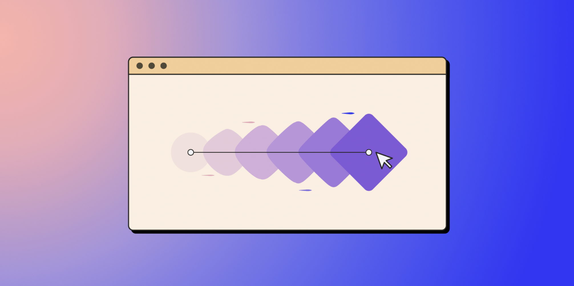
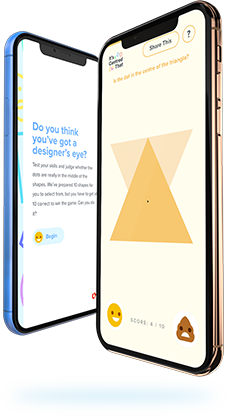
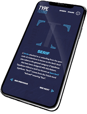
What is animation when it comes to web design?
Animation is not just simply … and …. anymore. Animation is defined as a method where individual images are combined to make them appear as one smooth singular motion. From large scale moving assets, hover effects and in view transitions, nods to animations in web design are becoming increasingly popular due to their interactivity and user-friendliness.
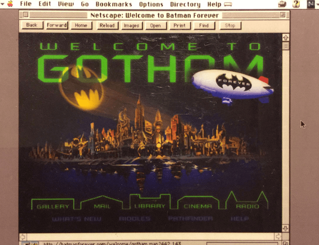
During the early years of Web 1.0, websites were frequently designed static and simple, heavily influenced by layouts from the print world. However, numerous designers made conscious efforts to incorporate early arrangements of web animations to make sites more attractive and engaging. One of the first uses of GIF animations within a website was on Jeffrey Zeldman’s Batman Forever in 1995. The Godfather of the web met his users with Batman flying towards them, animated as a picture sequence. This later inspired other designers to incorporate GIF web animations into their sites, creating ‘quirky, eye-catching elements within their websites’.
Animation in web design successfully creates moments of opportunities to hold a user’s attention. Whether that’s with the aim of increasing conversion rates, illustrating a key message or to simply move assets on the page in an organic fluid way as the user scrolls – similarly, to draw our attention to certain information.
But the million dollar question: if a static picture is worth a thousand words, how much is an animation worth?
How can animation help lift your website design?
Design enhancement
Choosing the right animation effects can breathe life and motion into a website’s design, which if executed successfully can leave a positive lasting impression. This may seem as obvious as putting the milk last in your morning brew, but an attractive website design is one which users prefer to navigate around and therefore stay longer and revisit. The emphasis here is that if implemented correctly, animations can enhance your site’s design and usability without hindering the user experience. As animations can hold moving complex assets, should one break, you do not want the usability of your website to be impacted.
Visual storytelling
Integrating animations within a website’s design can also allow developers to ‘interlink website elements and events’, conveying authentic stories and messages for the user via the site’s content and visual assets. This can work to establish a more intentional flow and impact Scrollytelling is a great example of bringing long-form content to life, triggering animations on a user’s scroll. Its success is established via its instant creation and movement, actively consuming users within the site’s content — creating a portrayal of ‘control, exploration, and discovery’.
Visible feedback
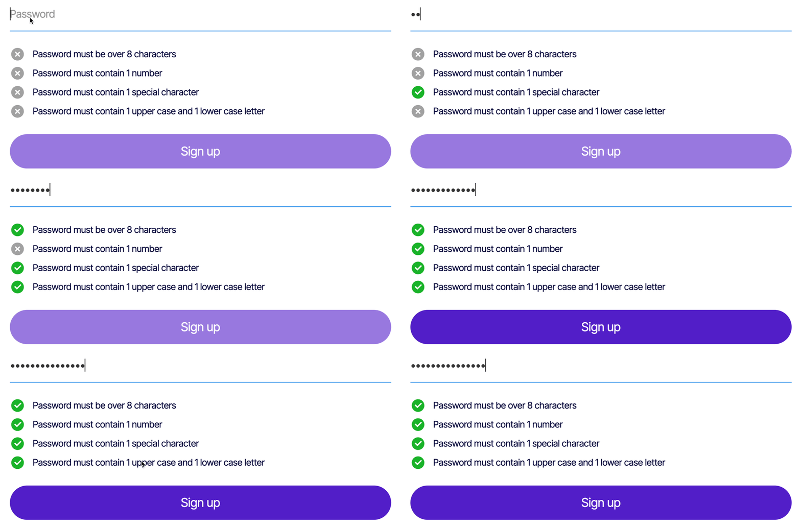
Visible feedback refers to an animated response to a user’s action. Successful interactive design provides feedback and insights which conveys the results of an action or encounter. Often users are unaware of what elements are interactive which can frustrate and annoy them. Visual feedback makes this easier through visibility making the user’s actions easier to understand. Examples include:
- Loading bars or animations which display after a user has clicked a button to submit information
- Subtle hover animations
- Error messages and animations that show where incorrect data may have been entered in an online form
What impact does it have on your website and brand?
We believe that animations can contribute to the appeal and attractiveness of websites and mobile apps. When incorporated properly, animations have the ability to build strong connections between a user and the content they are consuming.
Increased engagement
With a user’s attention first being directed to a moving image and not to static objects, animations are key to increasing user engagement. Animating elements within a website’s design such as buttons and links can retain a user’s interest and attention as well as increasing clicks by encouraging them to explore the site further. Incorporating these simple yet effective animations can enhance and establish a more gratifying experience, hopefully establishing brand trust and relatability.
Builds brand culture
Through animations, brands have the opportunity to convey their personality, giving users a sense of ‘your culture, ethos and values’. This further allows brands to include their audience within the journey of the site – told through your brand’s voice and character. It is this connection which establishes and builds loyalty with a brand.
Using animations to communicate your brand’s personality and identity can help your business to stand out within the digital online space. This is very dependent on brand perceptiveness and sometimes it can be effective to animate your audience.
If incorporating animated characters into your web design it is important that these reflect your audience which can be established by creating user personas. This will allow audiences to instantly identify with your character, inferring that the animation was made specifically for them.
Translation
Emotional impact is a key reason why websites incorporate animations. Websites have the ability to immerse users into an almost personalised one-of-a-kind journey. Animations can provide direct emotional translations to your clients, conveying messages of how your users view your brand. In some ways, animation is skeuomorphic. When implemented correctly, they can anchor real-world interactions and make users feel more connected and reassured by your brand
Types of animation in web design
At present, animations within web design considerably vary. Currently, animation effects are incorporated with the main purpose being functionality and improving a website’s usability. Let’s look over some of the standard types of animated website designs (you may have come across some of these already on our website).
1. Hover
Hover animations occur when a user hovers over an element with their cursor and the element responds with a desired motion or animated effect. These can highlight key information on a website as well as enhance the site’s interactivity. Adapting an element’s colour on hover can help focus a user’s attention on an element in an engaging and playful way.
2. Page Motion
Whole page animations usually involve subtle movements of the site’s entire background. The use of motion can make a UI expressive and easy to navigate. It’s important to not overdo the amount of animations if adapting the background as it is important to maintain a site’s harmony and balance. Examples include having a large 3D asset animating in the background or simply having numerous gradients following an SVG path – both which feature on the Hematogenix website below.
3. Scrolling
Hijacking a user’s scroll produces opportunities to create almost optical illusions. Scroll animations such as parallax scrolling uses a technique which causes the background to move at a slower pace than the content in the front. This can successfully lengthen page visit times by playing off the curiosity of your visitors, encouraging them to explore your entire website.
4. Backgrounds
Another popular animation type is incorporating background movement. These can include elements such as links which can demonstrate animations on hover or aesthetic elements which create dynamic designs. These effects are added to provide increased visual interest to a website’s background and the site’s interaction.
With a website’s background being a striking key feature within its design, these need to be engaging and eye-catching. Because of this, exaggerated and innovative backgrounds are becoming a new focal feature in effective web design.
5. Attracting attention
Including fast sleek animations into your website’s design will be more effective in attracting your user’s attention especially if occurring outside of their focus. Adding motion to motionless areas can quickly exaggerate an area, particularly if the movement or shape of an object is exaggerated beyond realism – further enhancing interest and appeal.
6. Navigation and menus
Navigation is one of the most common animations on a website. Hidden navigation is becoming increasingly popular by providing a smoother, sleeker user experience. Designers often use this technique to remove whitespace on the screen. By clicking on an icon, this allows the user to be navigated to a new screen with ease dynamically.
Navigation animations successfully organise the UX architecture of a website making it more accessible in an engaging and interactive manner.
7. Loading animations
Loading animations are notifications which reassure users that the system is still handling their request. By simply animating these notifications, this gives users a visible real-time update (or distraction) — which can make waiting more bearable.
With our attention span continually getting shorter (now only 8 seconds!), making your user wait those extra few seconds for a website to load can become a dealbreaker(almost like ‘It’s boring, but it works’). To prevent users from leaving the site, it’s important for designers to come up with strategies to make the wait time less tedious by including visually pleasant animations.
How to implement animations in your web design?
Animations can be incorporated by using standard CSS which can animate HTML elements without the need of JavaScript or by using specific CSS libraries.
Animation libraries
CSS animation libraries consist of ready-to-use animations which can be easily installed and integrated into your projects.
Below are three popular css animation libraries.
1. Animate.css
Animate.css is a library of immediate, cross-browser animations for free use in your web projects.
2. Hamburgers
Hamburgers is a collection of CSS hamburger animation examples which can be incorporated into your navigation for mobile devices.
3. Animista
Animista is a CSS animation library where you can play and trial a collection of ready-made CSS animations.
CSS
Alternatively, vanilla CSS animations allow elements to gradually change from one style to another. These animations consist of two key components, a style which describes the CSS animation and an accompanying set of keyframes which indicate the start and end states of the animation’s style.
There’s an infinite amount of CSS animations we can use such as CSS filters. For example blur(), brightness() and saturate() as well as CSS transforms which can further enhance a simple component.
Examples of animated web design
1. Campfire
This site plays off their contrasting bold colour palette and playful ‘doodle-like’ animations to capture their brands personality through SVG animations and bold interactive floral hover states.
2. Spotify – Astrology Club
Their bold, simplistic loading graphic effectively distracts the user and maintains their interest while they wait for the content to load.
3. Cavenwell
The use of three.js creates a more fluid identity for Cavenwell, taking the brand away from a static look that was more appropriate for a conventional brand.
4. Heights Agency
The interactivity within the team carousel and the exaggerated bright arrows play off the playful feel of the brand, successfully utlising the transformation of the image on change to reflect the direction of the user’s click.
5. Saville Row Projects
Parallax scroll animations have been successfully incorporated into this website, allowing the content and imagery to glide along the contents guidelines. The elongation emphases their expertise as partition experts but also creates a sleek, professional feel across their site.
6. Wolves Art
The contrast and adaptation of the background colour on hover successfully grabs the attention of the user and directs them towards the main ‘contact’ cta.
7. Visual Creatures
The expansion of their navigation items through microinteractions on hover and active GSAP animations on scroll establish a strong brand identity and successful user interactivity, echoed in their exaggerated cursor movements and assets.
8. Fleava
Fleava incorporated numerous animation techniques into their website including a subtle background movement of the organic shape in the hero area, parallax scrolling across the site, image reveal on hover within the navigation menu and much more. However, the subtleness and simplicity of it complimented with their neutral color and typography choices prevent the site from feeling crowded and overwhelming and instead portray professionalism and style.
9. SIRUP
The rotating animation of the record as the loading graphic successfully represents the movement of a physical record – establishing trust and familiarity from the outset. The site also features numerous textures and layers all which are slightly animated from colour to positioning adjustments. The focal point being the stacked CDs relies on Three.js and scroll trigger to really capture the user’s attention, encouraging them to browse the selection and site further.
10. GamiFi
The use of 3D gaming assets allows GamiFi to retain their playful feel that is important to gamers of any generation. The scroll animations and 3D assets which follow the cursors movement anchor this.
Can you think of any other innovative and creative animation styles or know a cool website which incorporates some of these well? Let us know by tweeting us at @supremohq.
