Medicys
Medicys are a group of market researchers who, after being founded in 2002, have experienced global success in the healthcare industry. Despite this, their brand had remained untouched. Medicys approached us with the challenge of refreshing their existing brand in celebration of their 20th anniversary. This included reworking both their brand identity and website.
Services
The start of a new era
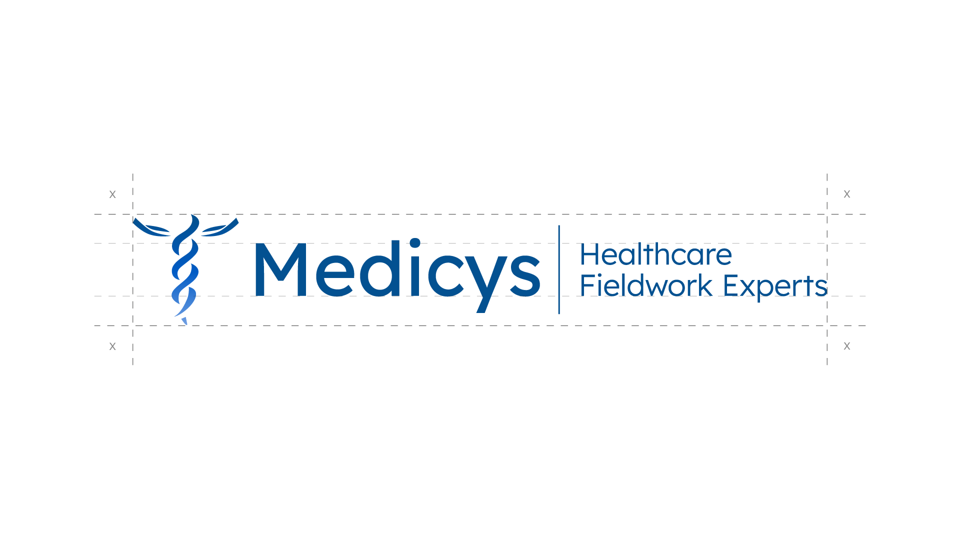
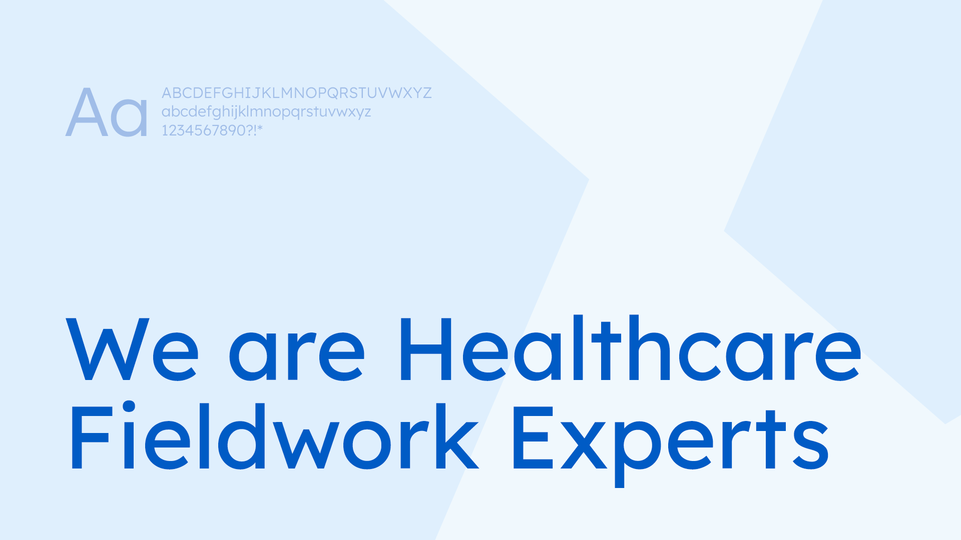
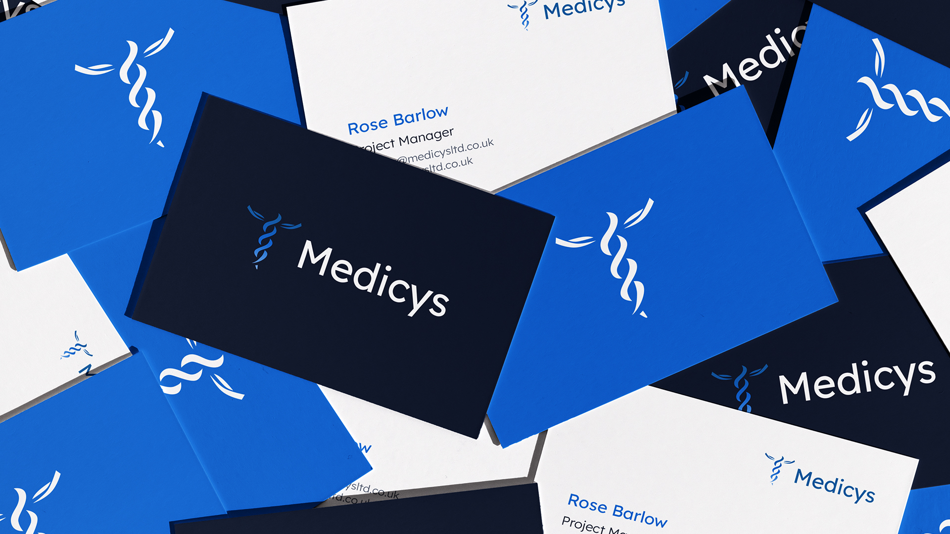
The Medicys brand had experienced 20 years of success within their industry. The challenge of our branding team was to inject new life into the logo without losing their previous identity that was so recognisable amongst clients and partners within the healthcare sector. Introducing a gradient into the logo, opting for a more contemporary typography combined with a refreshed colour palette worked to subtly modernise the brand.
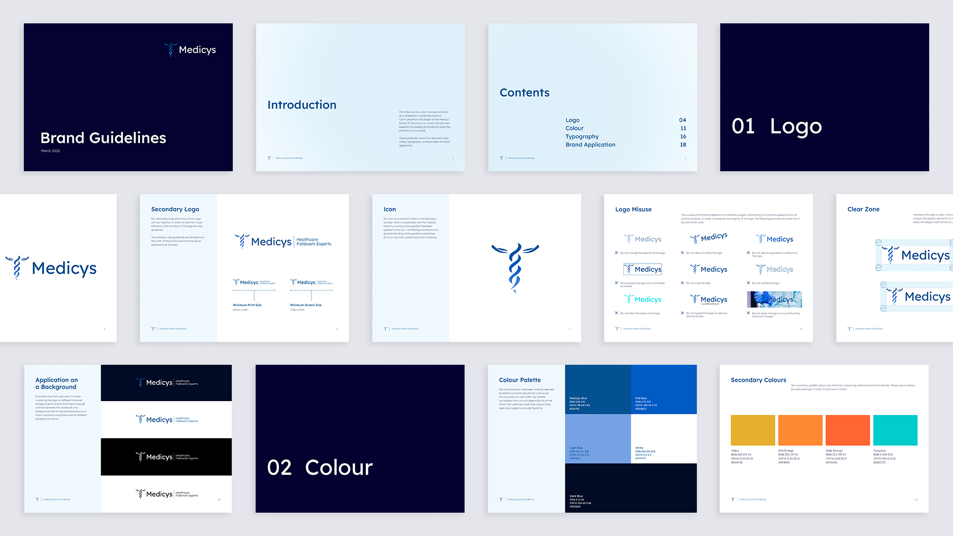
Brand rollout operation
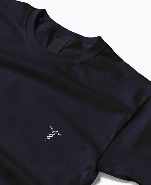
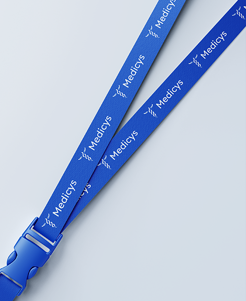
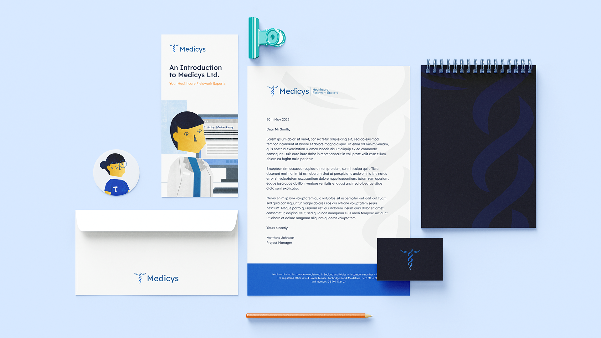
Next we rolled the Medicys brand out, at scale. We restyled their current animations, pitch decks, email signatures, CV templates and more before using Medicys’ new brand assets to create an explainer video which further showcased their slick new brand.
Showcasing success
In terms of the website, our first task was to restructure the site. Due to the successful growth of Medicys, who have now helped over 300 clients, they possess an extremely high volume of case studies. We took the website back to wireframes to help decipher the best way to display their abundance of great work.
We came up with the solution to implement ‘cards’ that allowed the user to filter Medicys case studies by category or keyword. This subsequently made their work section easier to navigate and ensured all of their case studies were findable.
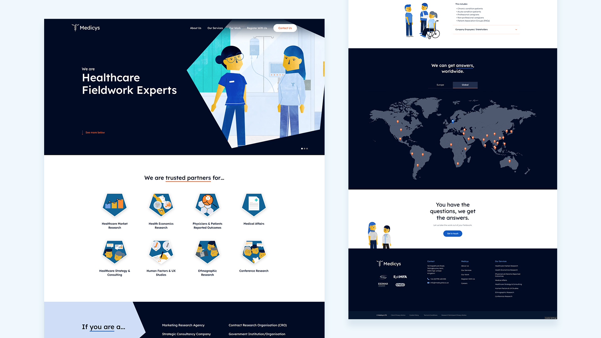
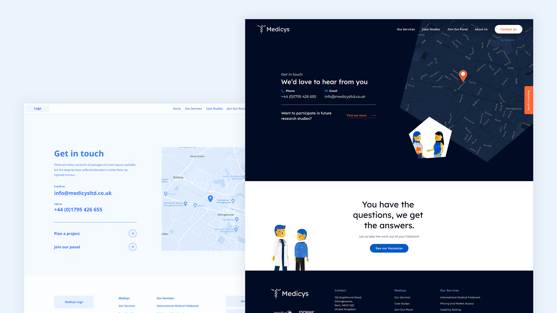
Delivering a website with character
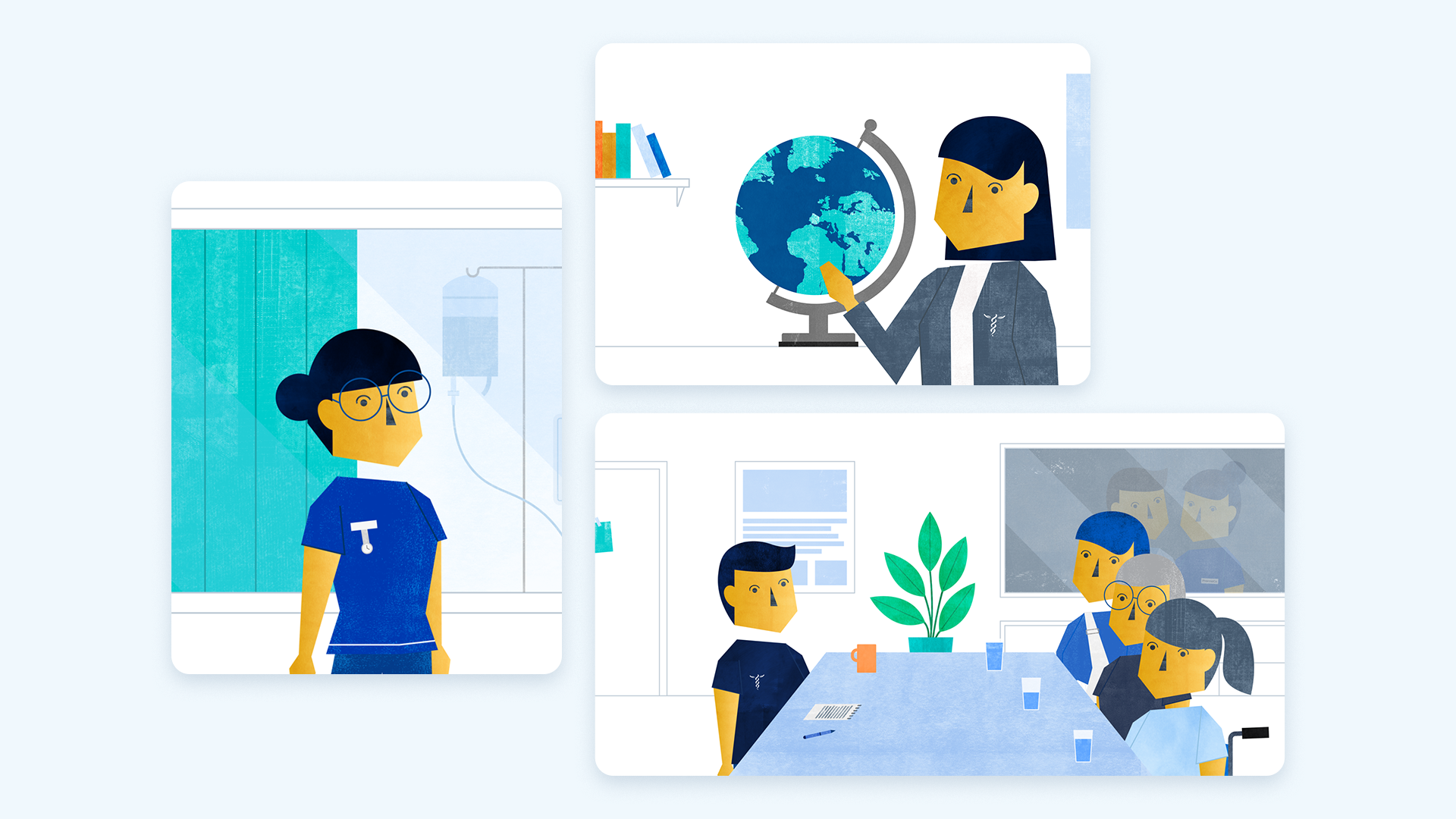
The UI of the website needed to achieve two things. Firstly it needed to compliment the UX and visually demonstrate that Medicys were a global brand. Secondly, the website needed to display the journey that Medicys take their clientele on and help showcase the Medicys-client relationship in a warmer manner.
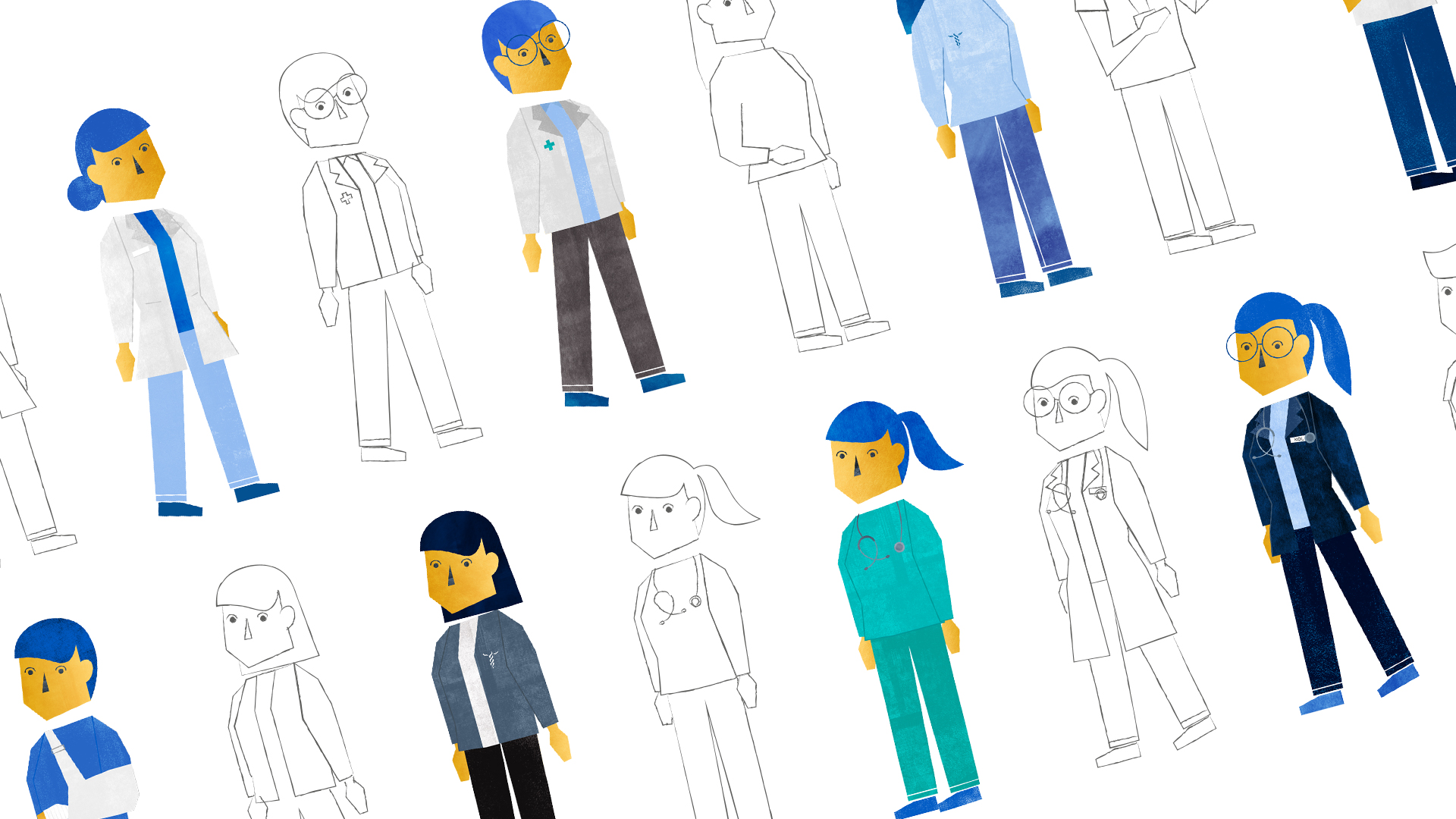
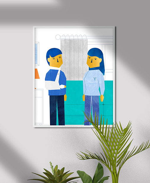
To achieve this we refreshed the design of their branded characters, created new illustrated scenes, introduced animation and uplifted the Medicys pentagon that had become a strong emblem of the brand.
“The refreshed branding and new website, just a couple of weeks since launch, have already elicited positive feedback and enquiries from both new and existing clients. The team at Supremo is clearly very experienced with each team member an expert in their area. I found Supremo to be very reactive and would recommend them for those looking at a premium service.”
Next - Cavenwell
Creating a bridge between traditional legal services & web3 with brand
View project